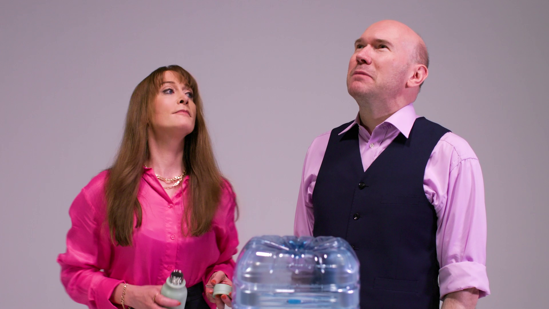
So, what’s my case? Well this is why I think quirky works:
It’s visually memorable: Picture an eccentric rodent exterminator (played by Mark Heap) and his trainees (including Olivia Colman) on their first house-call to remove a rat. Next thing you know you’ve got a soul-singing angel in a demolished bathroom delivering a stress lesson. Watch the preview and see if you agree with me that you won’t forget this scene.
It’s verbally memorable: Cut to an actor doing a voice-over for a coffee commercial who is frustrated by the stress-inducing director. The director coaches the talent by saying “How about if you try the whole thing… like a cup of coffee? You’re not so much the coffee, you’re more the vessel, yeah, like the cup. Does that help?”
Quirky, exaggerated characters can help learners reflect on their own behaviour: A penny-pinching hospital director doing his budget calls doctors out of surgery to ask “what is the maximum number of patients you can operate on at any one time?”
So that’s my case for a bit of quirkiness in a training video. In terms of “longer lasting learning” I think it works really well. The learning points are encased nicely in quirky little sketches, so I could recall them on the spot if I needed. That said, it’s important to know your audience: this training video is definitely about stress prevention. For those suffering severely from the symptoms of stress this isn’t the right approach.
Some will not value the avant-garde style of this video with its double-speed scenes set to techno music, but some will love it. I’ll leave you to make up your own mind…


